Ceres:
Brand Identity
-
Task
Create an updated branding system for a non-profit organization based in Boston. The branding system must be ambitious, united, and genuine to mimic Ceres’s efforts towards a more sustainable future.
-
Solution
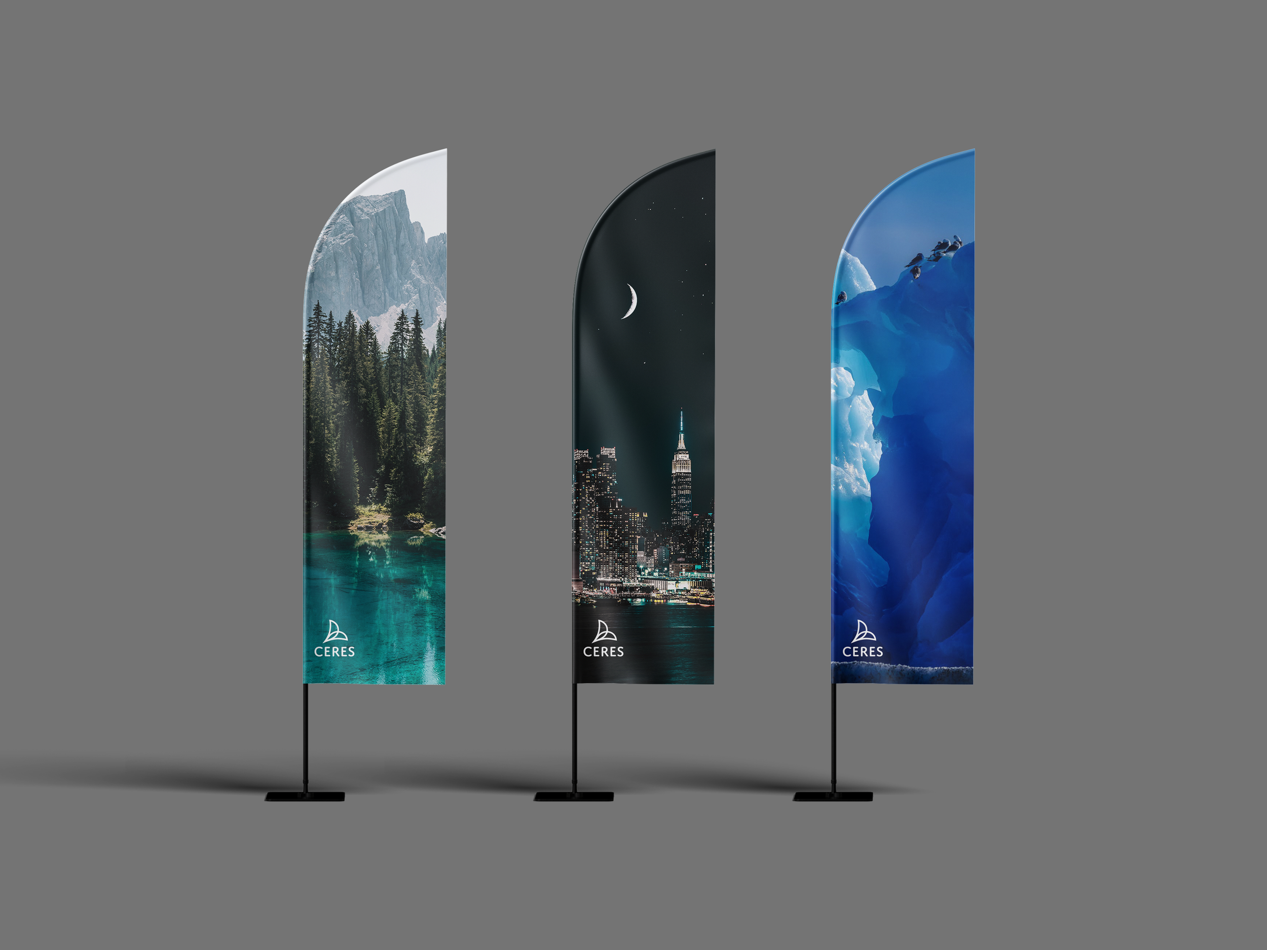
Creating an abstract logo to better encompass what the organization stands for, and keeping sustainability in mind when it comes to Ceres’s touch points. The touch points are made out of recyclable materials to emphasize Ceres’s transparency and passion for going green.
-
Applications
Updated branding identity including logo design, stationery set, flyers, signage, and touch points such as; banners for Ceres’s conventions and other events.
The abstract logo is indicative of a plant growing upwards much like how Ceres helps brands build a better reputation through sustainability. The logo reaches upwards to symbolize Ceres’s ambition and aim towards a better, more eco-friendly future. The semi-circular shapes resemble leaves to further Ceres’s efforts in protecting the environment. The shapes overlap each other to represent the phrase, “two parts of a whole,” to show how Ceres unifies the natural world and the corporate world.


