Blaze Energy:
Brand Identity
-
Task
Create a cohesive branding system for an energy drink company. The branding system must be bold, aggressive, and energetic to parallel Blaze Energy’s vibrant flavors.
-
Solution
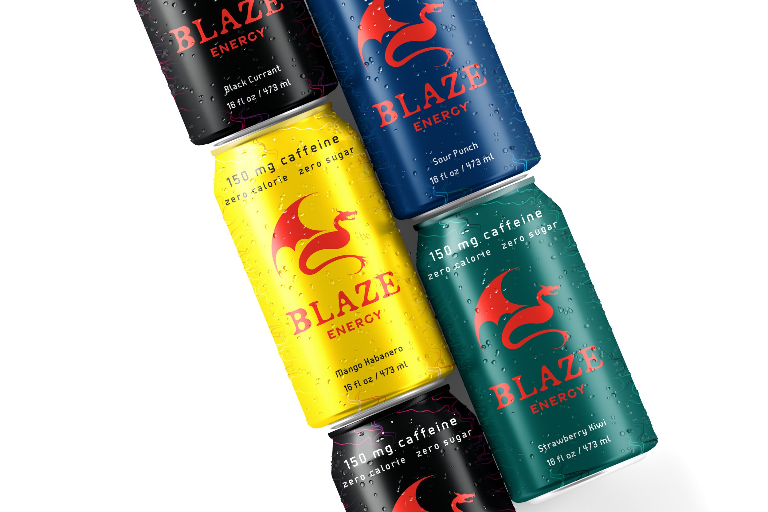
Creating a logo that is both fun and intense, while creating two different patterns with a variety of colors to help distinguish between the two caffeine options and the four flavors that Blaze Energy offers.
-
Applications
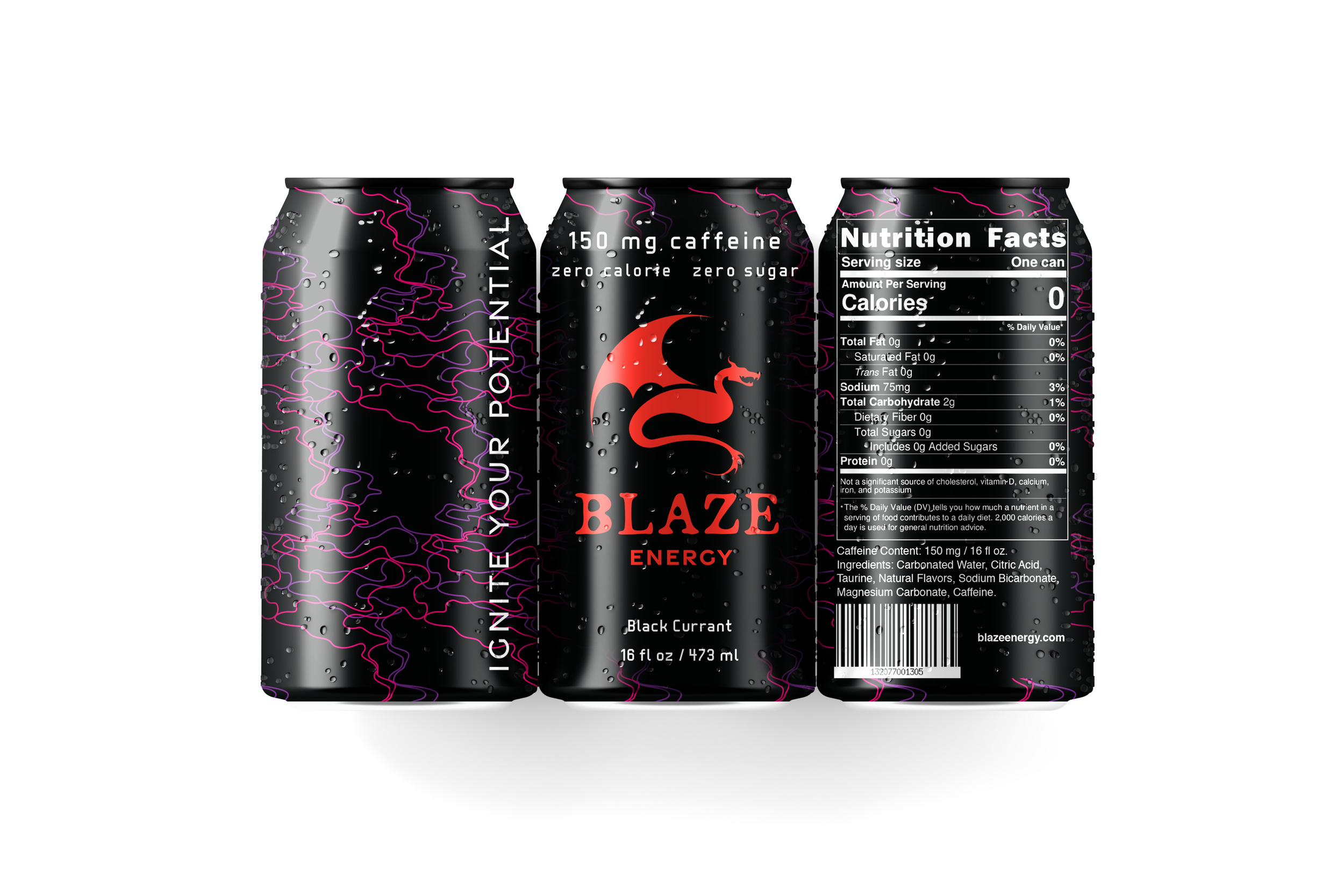
Cohesive branding identity including logo design, package design for Blaze Energy’s eight different cans, and web design.
A dragon was chosen for the logo because it represents Blaze Energy’s bold and aggressive attitude. The sharp angles seen throughout the logo reinforce this. Blaze Energy’s intense flavors; black currant, strawberry kiwi, mango habanero, and sour punch are each paired with different color palettes that make the red dragon stand out. The logo also relates to the energetic patterns on the cans; smoke, for the caffeinated options, and scales, for the caffeine free options.
Caffeinated Options


Caffeine Free Options


