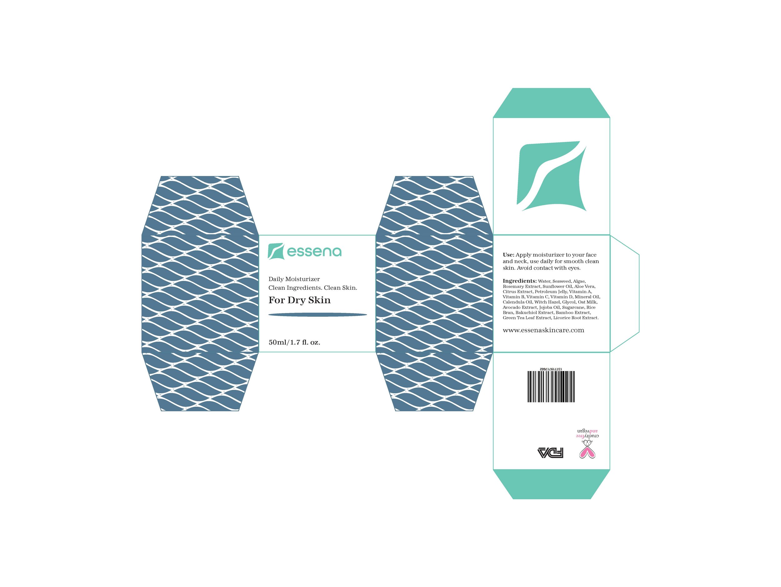
Essena:
Brand Identity
-
Task
Create a cohesive branding system for a skincare company. The branding system must be direct, peaceful, and organic to resemble Essena’s natural ingredients.
-
Solution
Creating packaging with a unified color palette and a variety of different patterns for Essena’s three different moisturizers, while maintaining a clear and cohesive design that pairs well with the abstract logo.
-
Applications
Cohesive branding identity including logo design and package design for Essena’s all natural moisturizers.
The abstract logo is indicative of a pair of lips; to represent the beauty aspect, a wave; to represent hydration, and a stingray; to represent the moisturizers’s smooth texture. The upper half of the logo was used to create the organic patterns. Essena’s moisturizers are available for the three main skin types; oily, dry, and sensitive. The white space in the packaging and curvilinear lines in the patterns and logo create a peaceful tone while the list of all natural ingredients creates transparency for the customer.


